Fun Dream
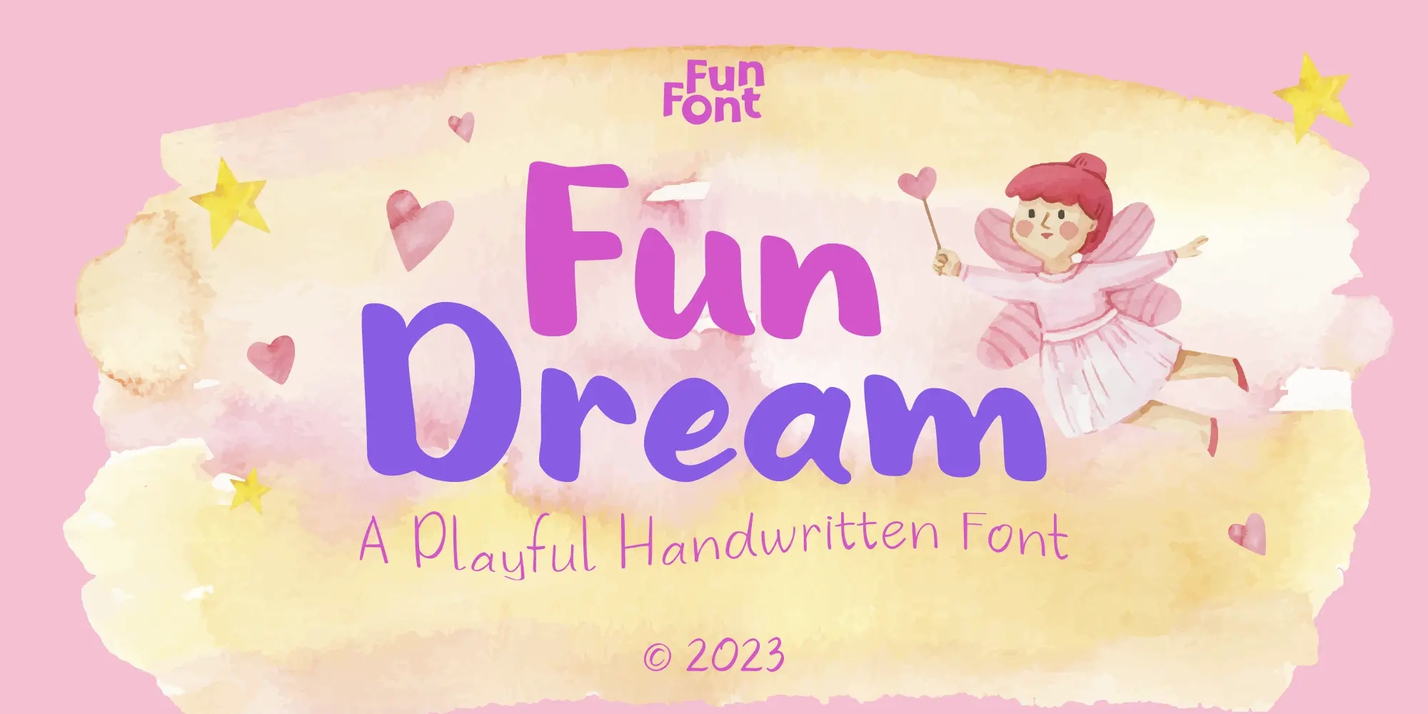
Fun Dream: A Playful Handwritten Font That Captures the Magic
Some typefaces are built for authority. Others are built for precision. And then there are fonts like Fun Dream, built for the pure, unguarded joy of creative expression. A playful handwritten font with a dreamy, whimsical character, Fun Dream captures the visual feeling of a child's imagination at its most free: spontaneous, warm, a little irregular, and completely full of life.
For designers working on children's books, creative branding, or any project where typography needs to feel emotionally warm and genuinely expressive, Fun Dream delivers something that polished, constructed typefaces simply cannot.
Where Fun Meets Dream
The name Fun Dream brings two ideas together that naturally belong in each other's company. Fun is immediate and energetic, reflected in the movement of the letterforms and the slight irregularity of a hand that writes with enthusiasm rather than caution. Dream is softer and more expansive, expressed through rounded edges, gentle flow, and the sense that the typeface exists somewhere between reality and imagination.
Together they describe a typeface that occupies a very specific emotional register: not childish in a reductive sense, but genuinely connected to the way children experience creativity openly and imaginatively. That quality makes Fun Dream particularly useful for designers creating projects that need to evoke warmth, wonder, and a sense of possibility.
If you enjoy this Playful design, you may also like Fun Play for a fresh creative alternative.
Inspired by the Freedom of a Child's Imagination
Fun Dream draws its inspiration from children's imaginative worlds, the kind of free, colorful, boundary-free thinking that produces drawings full of unexpected details and writing that feels like it's headed somewhere exciting even when the destination remains unknown.
The design translates that energy into typography through three guiding principles.
The first is natural handwriting flow, with letterforms constructed to feel as though they came from a moving hand rather than a drawing tool. The second is slight irregularity, a deliberate structural looseness that prevents the typeface from feeling mechanical or repetitive. The third is rounded softness, smooth edges and gentle curves that give the typeface its dreamy visual quality.
Understanding how handwriting-style typography creates emotional resonance helps explain why these design decisions matter. Irregularity signals authenticity, rounded forms communicate warmth, and natural flow creates a sense of presence. Together they produce a typeface that feels alive and expressive.
Design Characteristics: Rounded, Expressive, and Gently Irregular
Fun Dream's visual personality rests on the balance between readability and expressiveness. The letterforms are rounded and soft, built without sharp angles or geometric rigidity. Every stroke ends gently, and the overall character communicates ease and warmth before anything else.
Its deliberate structural irregularity creates an authentic handwritten appearance. Letters sit at slightly different angles, strokes contain the subtle inconsistencies found in real handwriting, and the rhythm of words feels natural rather than mechanical. This balance is difficult to achieve: too much irregularity can reduce readability, while too little can remove the organic quality that makes a handwritten typeface feel genuine.
Fun Dream is available in OTF and WOFF2 formats, supporting both professional print production and digital deployment across websites and interactive applications.
Features at a Glance
Fun Dream's OpenType features provide meaningful creative and typographic control:
- 2 Character Variants (cv01, cv02) for alternate letterform options that allow designers to fine-tune the visual personality of specific letters.
- Standard Ligatures (liga) and Discretionary Ligatures (dlig) for natural letter combinations and smoother handwritten flow.
- Fractions, Superscript, Subscript, and Scientific Inferiors for educational and instructional content.
- Ordinals (ordn) for numbered design elements in books, activity materials, and structured content.
- Localized Forms (locl) for accurate multilingual rendering across supported language systems.
- Mark Positioning (mark, mkmk) for accurate placement of diacritics in multilingual typography.
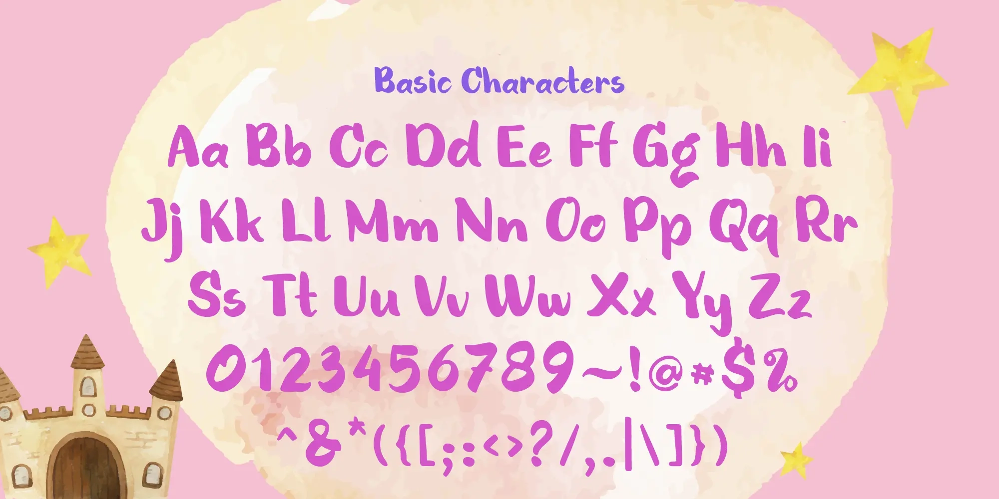
- Kerning (kern), carefully calibrated to maintain the natural handwritten feel while ensuring consistent letter spacing across the full character set.
The inclusion of Character Variants alongside both Standard and Discretionary Ligatures is particularly valuable for a handwriting-style display font. These features introduce subtle variation into repeated characters, one of the most effective ways to create a more authentic handwritten appearance in larger text settings.
Ideal Use Cases
Fun Dream's expressive and whimsical character makes it a natural fit for creative applications where warmth and imagination are primary communication goals:
- Children's brand identity projects for educational products, creative learning platforms, and children's media.
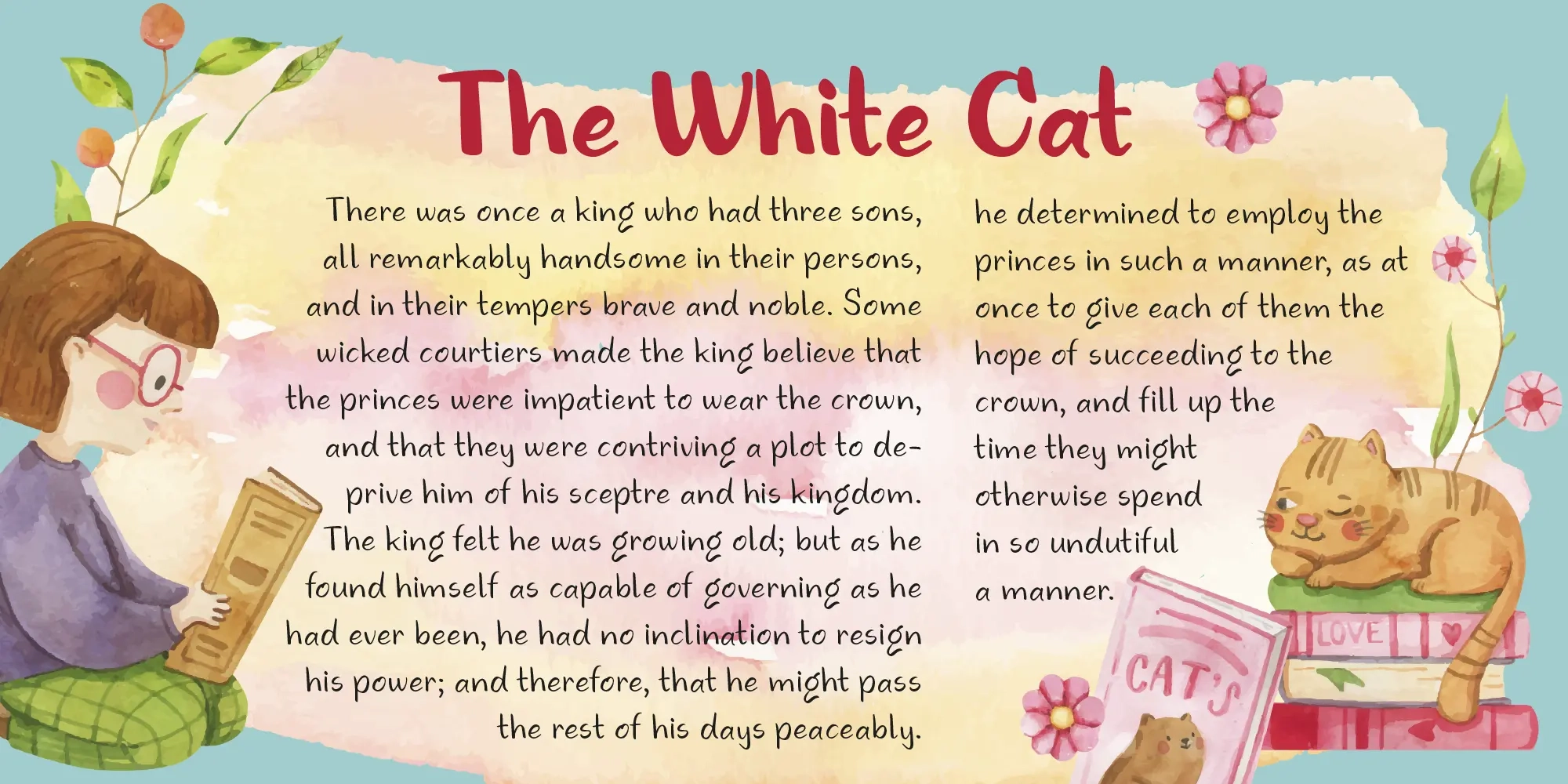
- Children's publishing, storybooks, and illustrated narratives where typography contributes directly to visual storytelling.
- Posters and display headlines that benefit from a friendly and approachable handwritten aesthetic.
- Social media content designed around creativity, warmth, and personal expression.
- Creative packaging for toys, craft kits, art supplies, children's products, and playful consumer goods.
- Fantasy-themed and imaginative visual projects requiring a sense of wonder and possibility.
For designers working in children's publishing and educational content, Fun Dream fills an important niche: a handwritten display font with enough whimsy to feel magical while maintaining the clarity and readability necessary for effective communication.
Looking for a matching Arabic companion? Fun Play Arabic complements this typeface beautifully.
Typography That Dares to Dream
What Fun Dream ultimately offers is a connection to a way of seeing the world that great design often tries to evoke but rarely embodies so directly. Its irregular, rounded, warmly expressive letterforms communicate imagination and joy not as a marketing promise but as a typographic reality built into every character and every stroke.
Font Name
Fun Dream
Designer
Nur Syamsi & Bustanul Arifin
Version
Build 1.0 - 2023
Type Category
Latin : Playful
Glyph Count
414
Year Published
2023
Supported Languages
Afrikaans, Albanian, Asu, Basque, Bemba, Bena, Breton, Catalan, Chiga, Cornish, Croatian, Czech, Danish, Dutch, Embu, English, Estonian, Faroese, Filipino, Finnish, Friulian, Galician, Ganda, German, Gusii, Hungarian, Icelandic, Inari Sami, Indonesian, Irish, Italian, Jola-Fonyi, Kabuverdianu, Kalenjin, Kamba, Kikuyu, Kinyarwanda, Latvian, Lithuanian, Lower Sorbian, Luo, Luxembourgish, Luyia, Machame, Makhuwa-Meetto, Makonde, Malagasy, Maltese, Manx, Meru, Morisyen, North Ndebele, Norwegian Bokmål, Norwegian Nynorsk, Nyankole, Oromo, Polish, Portuguese, Quechua, Romanian, Romansh, Rombo, Rundi, Rwa, Samburu, Sango, Sangu, Scottish Gaelic, Sena, Serbian, Shambala, Shona, Slovak, Slovenian, Soga, Somali, Spanish, Swahili, Swedish, Swiss German, Taita, Teso, Turkish, Upper Sorbian, Uzbek (Latin), Volapük, Vunjo, Walser, Welsh, Western Frisian, Zulu.

Fun Dream
93px
1.2
0.0
Fun Dream
77px
1.2
0.0
Fun Dream
27px
1.2
0.0
Size
65px
Fun DreamLight
Fun DreamLight Oblique
Fun DreamRegular
Fun DreamOblique
Fun DreamMedium
Fun DreamMedium Oblique
Fun DreamSemiBold
Fun DreamSemiBold Oblique
Fun DreamBold
Fun DreamBold Oblique
Fun DreamRough
Fun DreamRough Oblique
Glyphs Preview
Fun Dream
Buying Options